School Mag
In this blog I will keep you up to date with all things that are happening for instance, what we could improve, what things were putting into it and so on.
At the moment in media studies me James and Scott are currently working on a school magazine based round Art, it will be called Total Art.
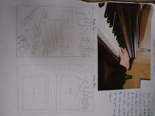
This is a flat plan of the magazine ideas that we were going to do before we made up our minds in which one to make.
So far we have taken plenty of photos around school of other peoples art work and copyed them onto the iMac`s pages. The images are scattered around the whole front cover which gives it an arty feel.
The title is in a certain font which makes the impression of it relating to the magazine itself.
The title is in a certain font which makes the impression of it relating to the magazine itself.
The things we could work on to make this magazine more appealing and interesting, is the amount of writing and text that is on the magazine. Weve only got a large amount of images placed around the magazine and the "Total Art"
Who is your target audience?
- Mainly people/students at a special Art school because its all about art
Is this clearly defined?
- Yes i would think so because the front cover is clearly presented to make it look like an Art magazine
Have you used succesful headlines + taglines + crossheads?
There isnt much text except for the heading and a small diagonal tagline at the bottom of the page which is a bit of a low but the headline stands out
How succesful was your planing/research/deadlines?
The planning didnt go as well as we thought it would, didnt really get to that, but the research we had was quite useful because there was a lot resources we could use to help us with the process of making the front cover e.g school art work done by other students
What have you learnt and what will you improve?
I have learnt that there could be so many different ways to present the front cover in terms of layout and theme etc. Also how to work independantly without the help of the teacher and others. The things that we/I could improve would be adding more text on the page to give the viewers more insight on what there reading, also the presentation and layout of the images on the front cover, this is because there scattered all around the page, overlapping each other so you cant really get a clear picture most of the time.
Lately weve had a presentation in class showing how far weve got in our magazines etc. by that time ours was printed out in glossy paper(courtesy of Mr Gallop) and we had to show it to the class. A couple of mistakes were unmissable to the eye, including, in the bottom right hand cornere of the front cover there is a diagonal text box saying some information about the magazine, but the text was sideways instead of diagonal, also, although this wasnt really a big problem there was a small section of white paper sticking out at the bottom of the page.
Music Mag
For this seperate section of the project we have to work independantly to show how capable we are at achieving the magazine on our own. So far in my progress on this magazine There hasnt been much completed compared to the school one. Although I have almost completed my front cover, just need to put some pictures on and a bit more text.
Now im further on into this project, just finshing my contents and completed the front cover. The pictures ive included in my music front cover are about a dozen of electric guitar which are positioned at the bottom of the page. instead of them just being guitars ive made it so they look like playing cards which looks good. Also a big image of a piano for the background of the whole magazine(close up shot of keys).
Throughout the weeks of editing, ive made a few changes to the front cover, instead of the guitars being positioned at the bottom, there made into miniture cards with the guitars inside them, his gives it more creation and feeling to the magazine.
Ive now completed my double page spread. This is evolved around the 1940s and 50s, set with images and information about that era.
These are some of the images I used:


This image is a first draft/ideas of the front cover that I was planning to do.
Ive made a lot of changes the the final product compared to these ideas although the image of the piano is used in the front cover.

